
Creating stunning giclée prints starts long before your artwork reaches the printer. Proper file preparation is crucial to achieving museum-quality results that accurately represent your original work.
Preparing Artwork Files for Giclee Printing
Correct file preparation plays a major role in achieving accurate colour, sharp detail and consistent results in fine art printing. Understanding how to prepare artwork files for giclee printing helps artists and photographers avoid common issues such as pixelation, colour shifts or unexpected cropping during production.
This guide explains the essential technical steps required before submitting files, including resolution settings, colour management, file formats and finishing considerations. Whether you are producing exhibition prints, limited editions or portfolio work, following these best practices ensures your digital artwork translates faithfully from screen to paper.
Resolution and Image Size
The foundation of any excellent giclée print is a high-resolution digital file. For optimal results, your image should be at least 300 DPI at the final print size. This resolution ensures that fine details remain sharp and colours blend smoothly without visible pixelation.
If you are working from a photograph or scan, calculate your maximum print size by dividing your image dimensions by 300. For example, a 6000 x 4000 pixel image can produce a 20 x 13.3 inch print at 300 DPI.
Pro Tip: Calculating Print Size
Image Width in Pixels ÷ 300 = Maximum Print Width in Inches
Example: 6000px ÷ 300 = 20 inches maximum width
Many artists make the mistake of trying to artificially increase resolution through software interpolation. While modern algorithms have improved, upsampling cannot create detail that was not captured originally. Always start with the highest resolution possible during photography or scanning.
For photographers working with digital cameras, shoot in RAW format at the highest resolution your camera offers. This provides maximum flexibility for editing and ensures you capture all available detail. When scanning traditional artwork, use optical resolution rather than interpolated resolution, and scan at least 600 DPI for artwork you plan to reproduce at actual size.
Colour Space and Profile
One of the most critical aspects of file preparation is working in the correct colour space. For giclée printing, use Adobe RGB (1998) or ProPhoto RGB rather than sRGB. These wider colour gamuts capture more colours and provide better results when converting to printer profiles.
The colour space defines the range of colours your file can contain. sRGB, designed for web display, encompasses only about 35% of visible colours. Adobe RGB expands this to approximately 50%, while ProPhoto RGB can represent nearly all colours visible to the human eye. For fine art printing, this expanded range is essential to capture subtle colour variations.
When saving your files, always embed the colour profile. This small piece of metadata tells software and printers how to interpret the colour values in your image. Without an embedded profile, different devices may display your colours quite differently, making colour management impossible.
Understanding RGB vs CMYK
While commercial offset printing uses CMYK (Cyan, Magenta, Yellow, Black), giclée printing typically works from RGB files. Modern giclée printers use extended ink sets – often 8, 10, or 12 colours – that can reproduce a wider gamut than traditional CMYK. Keeping your files in RGB preserves more colour information until the final conversion to printer-specific profiles.
If you have received files in CMYK from a previous print job, consult with your printer before converting to RGB. The conversion can shift colours, and it may be better to work from your original RGB master if available.
File Formats
Different file formats serve different purposes in the giclée workflow. Choosing the right format ensures your image data remains intact through the printing process.
TIFF (Tagged Image File Format) – Recommended
TIFF files are the gold standard for giclée printing. They support lossless compression (LZW or ZIP), which reduces file size without discarding any image data. TIFFs can store 16-bit colour depth, providing 65,536 tones per channel compared to 8-bits 256 tones. This additional tonal information helps prevent banding in gradients and preserves shadow and highlight detail.
TIFF files can also contain layers if needed, though most printers prefer flattened files. When saving as TIFF, ensure you select Embed Color Profile to maintain colour accuracy across different systems.
PNG (Portable Network Graphics)
PNG is an excellent alternative to TIFF, offering lossless compression and full transparency support. It is particularly useful for images requiring transparent backgrounds or when file size is a concern. However, PNG is limited to 8-bit colour depth in most applications, making TIFF preferable for maximum quality.
JPEG (Joint Photographic Experts Group) – Use with Caution
While JPEG is the most common image format, it uses lossy compression that permanently discards image data with each save. If you must work with JPEGs, always save at maximum quality (level 12 in Photoshop) and never repeatedly edit and save the same JPEG file. Better yet, keep an uncompressed master file and only create JPEGs as final deliverables.
PSD (Adobe Photoshop Document)
Native Photoshop files are acceptable for submission but should generally be flattened before printing unless you have specifically discussed maintaining layers with your printer. Save a separate layered working file for your archive and provide a flattened version for printing.
Bit Depth and Colour Information
Work in 16-bit mode whenever possible throughout your editing process. While the final print may be generated from 8-bit data, working in 16-bit prevents cumulative degradation from editing operations. Each adjustment in 8-bit mode can introduce posterization and banding, while 16-bit mode provides headroom to maintain smooth tonal transitions.
The difference becomes especially apparent in areas of subtle gradation – skies, skin tones, and shadow detail all benefit from 16-bit editing. Only convert to 8-bit as a final step if your printer requires it, and only after all editing is complete.
Sharpening for Print
Proper sharpening is essential but frequently misunderstood. The sharpening appropriate for screen display often appears excessive when printed, while images that look perfect on screen may appear soft in print.
Apply sharpening as the final step in your workflow, specifically for the print size and paper type. Textured papers absorb ink differently than smooth papers and typically require slightly more aggressive sharpening. When evaluating sharpness on screen, view your image at 50% zoom – this approximates how sharpness will translate to print.
Use Unsharp Mask or Smart Sharpen in Photoshop with conservative settings. Start with an Amount of 100-150%, Radius of 1-2 pixels, and adjust from there. Avoid over-sharpening, which creates visible halos and artifacts that become more apparent when enlarged for print.
Borders, Bleed, and Safe Areas
Consider how your image will be trimmed and mounted. If you want white borders around your print, include them in your file at the exact dimensions you desire. The border should be part of your image file, not added by the printer.
For borderless prints where the image extends to the paper edge, include at least 5mm (approximately 0.2 inches) of bleed on all sides. This extra image area ensures no white gaps appear if slight shifts occur during printing or trimming.
Keep important content – signatures, essential compositional elements, or fine detail – at least 10mm from any edge. This safe area accounts for handling during printing, potential trimming variations, and mounting considerations.
Pre-Flight Checklist
Before sending your files for printing, run through this comprehensive checklist:
- Verify resolution is 300 DPI at desired print size
- Confirm colour space is Adobe RGB or ProPhoto RGB
- Ensure colour profile is embedded
- Check file format is TIFF, PNG, or maximum-quality JPEG
- Review sharpening at 50% view – should look slightly soft on screen
- Flatten all layers unless specifically required
- Inspect for dust spots, artifacts, or digital noise
- Verify image dimensions match your intended print size plus any borders or bleed
- Save with a descriptive filename indicating size and version
- Create a backup of your master file before any conversions
Common File Preparation Mistakes
Upsampling Low-Resolution Images: Artificially increasing DPI does not add detail. A 72 DPI web image enlarged to 300 DPI will print poorly regardless of the number shown in the resolution field. Always start with adequate resolution.
Converting CMYK to RGB Carelessly: If your file is already in CMYK from previous print work, consult your printer before converting. The conversion can shift colours unpredictably, particularly vibrant blues and oranges.
Extreme Colour Saturation: Colours that look vibrant on screen may exceed the printers gamut. Soft proof your files to see how colours will translate to your chosen paper.
Neglecting to Flatten Layers: Unflattened files can cause unexpected rendering issues. Unless you have specifically discussed maintaining layers with your printer, always flatten your final file.
Using Filters Without Testing: Artistic filters, textures, and effects may look different at print size than they do on screen. Test critical effects at actual print resolution before committing.
Ignoring Paper Characteristics: Different papers render colours and detail differently. Smooth, glossy papers show maximum detail and saturated colours. Textured papers create a softer, more artistic look but may not capture the finest detail.
Monitor Calibration
Your monitor is your window into how your print will look, but only if it is properly calibrated. An uncalibrated monitor can show colours completely different from what will print, making accurate colour work impossible.
Invest in a hardware calibration device such as X-Rite ColorMunki, Datacolor SpyderX, or similar tools. These devices measure your monitors actual output and create a custom profile to ensure accurate colour display. Calibrate monthly, as monitors drift over time.
Calibrate to D65 white point (6500K) and 120 cd/m² brightness for print work. This provides a neutral reference that closely matches print viewing conditions.
Communication with Your Printer
Even with perfectly prepared files, communication with your giclée printer is essential for optimal results. Discuss these points before submitting your order:
Paper Selection: Different papers affect colour rendering, texture, and overall aesthetic. Matte papers provide a softer, museum-quality look. Glossy papers offer maximum colour saturation and detail. Cotton rag papers add prestige and longevity.
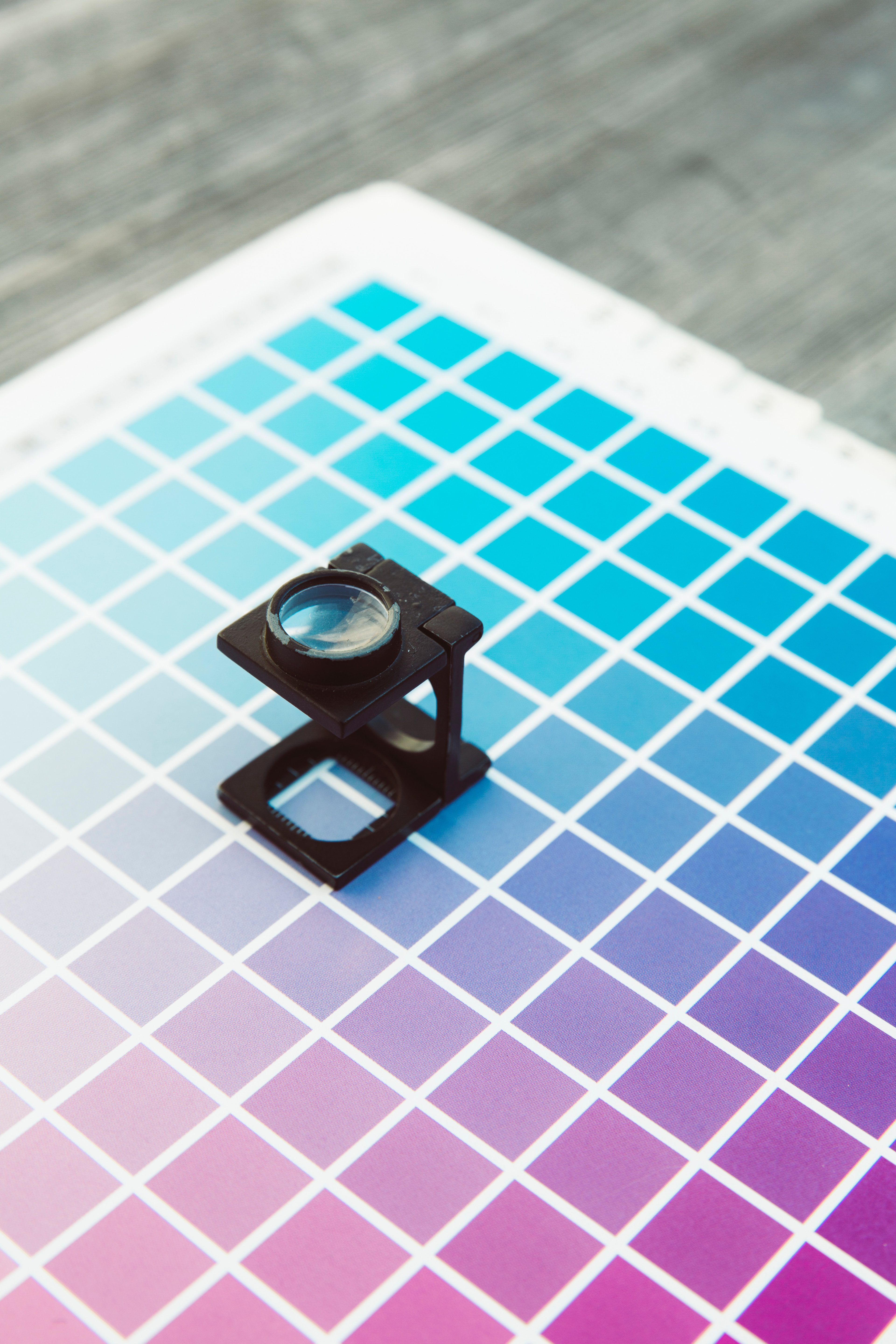
Soft Proofing: Request to see how your specific colours will translate to your chosen paper. Soft proofing simulates the printer and paper combination, showing you colour shifts before printing.
Test Prints: For critical projects, commissions, or limited editions, order a test print before committing to a full run. This allows you to evaluate colour, sharpness, and overall quality in person.
Colour Expectations: If specific colour accuracy is critical – matching a corporate colour, reproducing a historical painting, or maintaining brand consistency – provide physical reference samples or detailed colour notes.
Ready to Print?
Our team can review your files before printing and provide guidance on any necessary adjustments.
Final Thoughts
Preparing artwork files for giclée printing combines technical knowledge with artistic vision. While these guidelines provide a solid foundation, remember that giclée printing is as much art as science. Build a relationship with your printer, communicate your expectations clearly, and do not hesitate to ask questions about anything you find unclear.
At Giclée London, we are committed to helping artists achieve the finest possible prints. Our team can review your files before printing and provide guidance on any necessary adjustments. With over 40 years of experience in fine art printing, we understand that every artwork is unique and deserves individual attention.
Whether you are printing your first giclée or your thousandth, proper file preparation ensures your artistic vision translates faithfully from screen to paper, creating prints that will preserve your work for generations to come. The time invested in proper file preparation pays dividends in the quality and longevity of your finished prints.
If you have questions about file preparation for your specific project, our team is always available to help. Contact us at sales@gicleelondon.co.uk or call 020 8898 1987 to discuss your requirements.