

There is a question that comes up in almost every conversation we have with artists who are new to fine art printing, and it is one that deserves a much more honest answer than most studios are willing to give. What is archival ink, exactly? Not the marketing version. Not the version designed to make you click a button and hand over your money. The real version, with the chemistry and the consequences laid bare.
Because if you are a working artist selling limited edition prints, or a photographer producing work destined for galleries and collectors, this is not a trivial question. The difference between archival and non-archival ink is the difference between a print that looks as vivid in thirty years as it does today, and one that embarrasses you quietly from someone’s living room wall in three.
So let us go through it properly.
The Short Answer (Then the Long One)
Archival ink is ink formulated to resist fading, yellowing, and degradation over an extended period of time — typically defined as one hundred years or more under controlled display conditions. The word archival is not a legally protected term, which is part of what makes the conversation complicated, but in the context of serious fine art printing it almost always refers to pigment-based inks rather than dye-based ones.
That distinction — pigment versus dye — is where everything actually starts.
Pigment Ink vs Dye Ink: Why It Matters More Than You Think
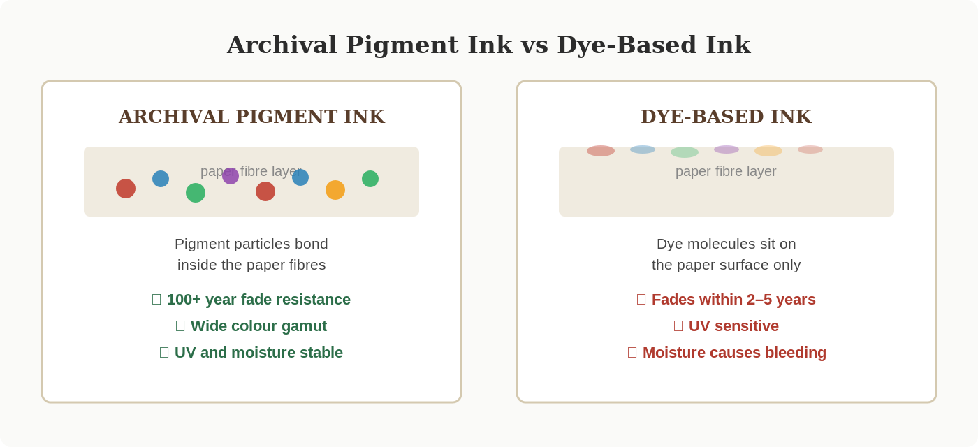
Most home printers, many high street photo labs, and a depressing number of online print services run on dye-based inks. Dye molecules dissolve completely in liquid. When the ink hits the paper, the dye sits largely on the surface of the fibres. It looks bright. It looks vivid. Often it looks more vivid than an archival pigment print straight out of the box. That initial punch is part of why dye-based printing continues to sell.
The problem arrives later.
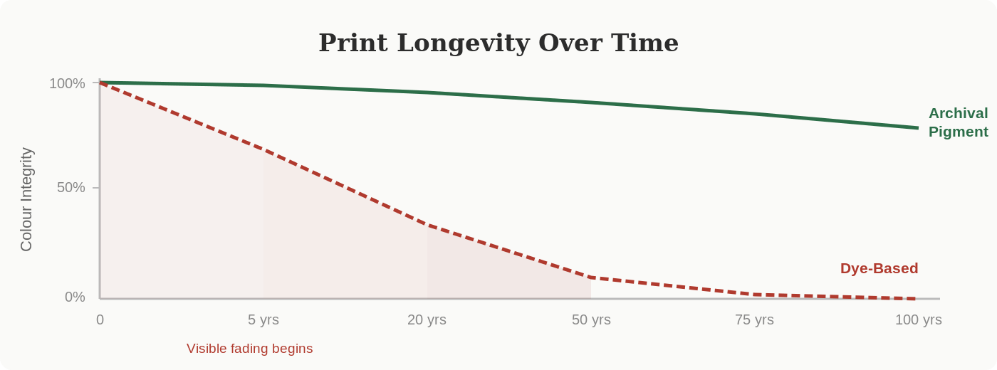
Dye molecules are inherently unstable when exposed to the things that prints encounter in the real world — light, oxygen, humidity, the compounds released by a sealed picture frame. The chemical bonds that create those vivid colours begin to break down. Within two to five years, depending on conditions, a dye-based print that looked extraordinary on delivery starts to look washed out, shifted in hue, or flat in a way the original never was.
Archival pigment inks work differently at a molecular level. Instead of dissolving, pigment particles are suspended in a carrier fluid. When they hit the paper, they do not just coat the surface — on the right archival paper, they penetrate the fibre structure and become physically embedded. The particles themselves are what carry the colour, and those particles are far more chemically stable than dissolved dye molecules. They resist UV light. They resist moisture. They resist the slow chemical assault of the environment around them.
The result is a print with a tested life of well over one hundred years before noticeable fading begins. That figure comes from Wilhelm Imaging Research, the organisation that sets the independent standard for print longevity testing, and it is based on accelerated ageing tests calibrated against real-world display conditions. It is not a number any studio invented in a boardroom.
What Lightfastness Actually Means
You will encounter the word lightfastness whenever archival printing is discussed seriously, and it is worth understanding rather than just nodding along. Lightfastness is a measurement of how resistant a colourant — whether ink, paint, or dye — is to fading when exposed to light over time. It is assessed using the Blue Wool Scale in many parts of the world, or via the ASTM International standards used widely in North America.
A pigment ink rated at the highest lightfastness level can be expected to retain its colour integrity for generations. A low-rated ink might begin shifting within months. The chemistry is not complicated in principle: some molecules hold together under photon bombardment, and some fall apart. Archival pigment inks are formulated specifically to use colourants that hold together.
This matters enormously for artists because it determines what your collector is actually buying. A print sold as a limited edition with a claimed archival quality is an implicit promise. If that promise is built on dye-based ink that has not been independently tested for longevity, you are making a commitment you cannot keep. That has consequences for your reputation that compound over time, quietly and relentlessly.
The Role Paper Plays in Archival Quality
Here is the part that often catches artists off guard: archival ink alone is not enough. The paper you print on is an equal part of the equation, and the wrong paper can undermine the most expensive, carefully chosen archival ink system in the world.
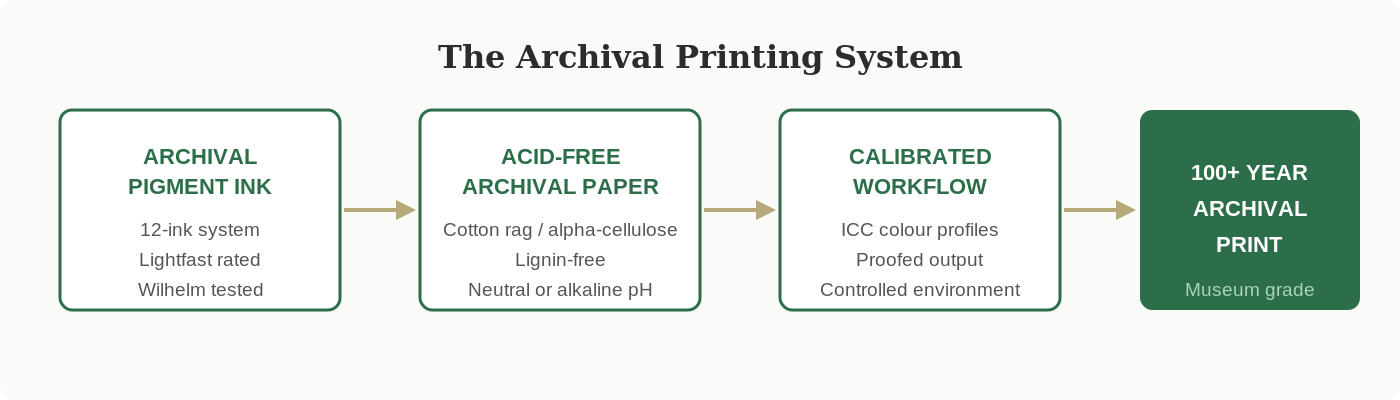
Archival paper needs to be acid-free, which means it will not yellow or become brittle as it ages. Standard wood pulp paper is full of lignin, a compound that breaks down under light and oxygen and produces the familiar yellowing you see on old newspapers. Museum-grade fine art papers are made from cotton rag or alpha-cellulose, which contain no lignin and have a naturally neutral or slightly alkaline pH. That chemistry keeps the substrate stable for centuries.
The coating on the paper also matters enormously. A cotton rag paper designed for archival pigment printing has a micro-porous coating that draws the ink in correctly, allowing those pigment particles to bond properly rather than sitting exposed on the surface. If you try to run archival pigment inks on cheap photo paper, you do not get archival quality. You get archival ink in a non-archival environment, which is not the same thing at all.
This is why the conversation about archival printing cannot ever be just about ink. It is about a system: the right ink, in the right printer, on the right paper, stored and displayed in the right conditions. Every link in that chain matters.
What “Archival Quality” Claims Actually Mean
Because archival is not a regulated term, you will see it applied to products and services that do not always deserve it. A few things to look for when a printer, a studio, or a supplier makes an archival claim.
First, ask whether the claim comes with independent testing data. Wilhelm Imaging Research ratings are the industry standard. If a studio is genuinely using archival materials, they should be able to point you to published test results for their specific ink and paper combinations. Vague language like “long-lasting” or “fade resistant” without numbers attached is not an archival claim. It is marketing.
Second, ask about the ink system specifically. A professional giclee studio running archival quality prints will typically use an eleven or twelve cartridge pigment ink system. This wider range of inks is not just about colour coverage — it allows for smoother gradients, more accurate neutrals, and better reproduction of the tricky mid-tones where cheap systems fall apart. The number of inks in a system tells you something meaningful about the quality of the output.
Third, ask about the paper. A studio that uses archival pigment inks should be able to tell you the exact paper stock for any print they produce — the brand, the weight, the coating type, and ideally the ISO certifications. Hahnemuhle, Canson Infinity, and Innova are names you should expect to hear. If the answer is a shrug and a mention of “premium photo paper,” that is the answer you need.
Why This Specifically Matters for Artists
A collector who buys a limited edition print from an artist is entering into something that goes beyond a simple transaction. They are investing in an object that they believe will be part of their life for decades, possibly something they will pass on. The prints that hold their value — financially and emotionally — are the ones that stay true to the original vision of the artist who made them.
Fading is not just a visual problem. When a print loses its depth, its saturation, or its tonal balance, it becomes a different object to the one that was sold. The agreement that existed between the artist and the collector — that this edition represents the artist’s work at its most faithful — has been broken, even if nobody intended it.
Artists who build their reputations on archival quality printing protect themselves from this. Their collectors know that what they bought will look right in twenty years. That trust becomes part of what people are paying for when they invest in an artist’s editions, and it is a competitive advantage that compounds over time.
Common Myths About Archival Ink It Is Time to Retire
Myth: If it says archival on the box, it is archival. As covered above, the term is unregulated. Any manufacturer can print it on packaging. Independent testing data is what matters, not label claims. Ask for the Wilhelm ratings.
Myth: Archival prints need special storage to last. Partly true, mostly overstated. Standard indoor display conditions — away from direct sunlight, in a stable humidity environment — are sufficient for well-made archival pigment prints to last well over a century. You do not need a museum-grade conservation vault. You need reasonable care and the right starting materials.
Myth: Archival printing means muted colours. This is the opposite of the truth. Because archival pigment ink systems use more cartridges — often ten to twelve separate inks rather than the four or six a standard printer uses — they can actually produce a wider gamut and more nuanced colour than dye-based systems. The assumption that archival means conservative is a hangover from early inkjet technology that no longer applies.
Myth: Canvas prints cannot be archival. They absolutely can. Canvas coated with the right receptive layer and printed with archival pigment inks performs comparably to paper-based prints in long-term fade resistance. The protective varnish applied after printing adds another layer of UV defence. A properly produced canvas giclee is a fully archival product.
Myth: Home printers with archival ink cartridges are as good as a professional studio. The ink is part of the equation, but only part. A professional giclee studio brings colour-calibrated monitors, RIP software that handles colour profiles correctly, ICC profiles matched to specific paper and ink combinations, and controlled print environments. The same archival ink run through an uncalibrated home printer with generic paper is not producing archival prints. It is producing prints with archival ink in a non-archival process.
How to Know if a Studio Is Actually Doing This Properly
Ask them what inks they use and which printer. Ask for the exact paper stock by name and weight. Ask whether they run ICC profiles and whether they will proof with you before the full print run. Ask where their longevity data comes from. A studio that genuinely produces archival quality prints will answer all of these questions without hesitation, because the answers are things they are proud of.
If the response is vague, if the answer is that they use “professional quality” materials without specifics, if proofing is dismissed as unnecessary or offered as an expensive add-on, take note. The studios that cut corners on archival quality know they are cutting corners. They just hope you do not know enough to notice.
The Long Game
There is a version of this conversation that sounds like it is about chemistry, lightfastness ratings, and ISO standards. And it is all of those things. But underneath it is really about what kind of artist you want to be.
The work you make matters to you. It should matter just as much in the objects that carry it into the world, onto walls, into homes, into the hands of people who chose to invest in it. Archival ink is not an upgrade. It is not a premium tier for artists who have already made it. It is the baseline standard for anyone who takes their practice and their collectors seriously.
Everything else is a ticking clock.
At Giclee London we run exclusively on archival pigment inks and acid-free museum papers. Every print is proofed. Every edition is produced with the next century in mind, not just the next review. If you are ready to talk about your work and what it deserves, we would love to hear from you.
Visit www.gicleelondon.co.uk to request a sample pack, book a studio consultation, or find out more about how we approach every print we make. Bring your most difficult file. That is usually where the most interesting conversations start.
Where to go next
- our quality guarantee — how we stand behind colour accuracy and archival quality
- our giclée printing service — museum quality fine art and photo prints on archival papers
- how to order — our simple step by step ordering process